Difference between revisions of "OrthodoxWiki talk:Logo Submissions/archive"
m (→Contest Results) |
m (→Votes: changing sig to reflect commenters current (and longstanding) tag) |
||
| Line 126: | Line 126: | ||
== Votes == | == Votes == | ||
| − | Since I'm going to be away at the close of submissions (and probably the close of voting), I submit my vote as the first logo by HappyGrevling (world, with cross superimposed, with scroll around it); with big thumbs up to his other two. -- [[User:Pistevo| | + | Since I'm going to be away at the close of submissions (and probably the close of voting), I submit my vote as the first logo by HappyGrevling (world, with cross superimposed, with scroll around it); with big thumbs up to his other two. -- [[User:Pistevo|Pistevo]] 00:23, 31 October 2005 (CST) |
| − | :Sorry for fuzziness - the vote went to ScrollLogo, "big thumbs up" referred to SealLogo1 and 2. -- [[User:Pistevo| | + | :Sorry for fuzziness - the vote went to ScrollLogo, "big thumbs up" referred to SealLogo1 and 2. -- [[User:Pistevo|Pistevo]] 00:09, 3 November 2005 (CST) |
Gotcha, thanks Pistevo! [[User:FrJohn|Fr. John]] | Gotcha, thanks Pistevo! [[User:FrJohn|Fr. John]] | ||
Revision as of 23:13, May 5, 2006
Contents
Logos by HappyGrevling

This submission is from User:HappyGrevling. He explains: "It has a stylized Orthodox cross in the background, with an image of the earth, representing universal, pan-Orthodox appeal. The logotype appears in an old looking scroll to give it an "ancient" feel."
Comments
- Looks nice! -Fr. John
- Minor: The lower part of the globe is a bit dithered. Better reproduce this part of the logo in a smoother full-color rendition (use non-palletized PNG for background transparency rather than GIF).
- Go with this one, although I'd give it a light Cyan bacground. The other three logos of my creation still have their uses. After the removal of the words "OrthodoxWiki", the first one would make a great church flag. The second has already been used as a wallpaper. The third one, if I can talk Fr. John into it, would be a part of a new section of digitized Church Scetches that would be nice to add to OrthodoxWiki. WebmasterConstantine
I like this one a lot -- It looks classy. My only hesitation would be that it might be too "Russian"-specific. But you definitely have some good graphics skill. Fr. John
I kind of like this one. Looks very official and clean.
North Star Logo
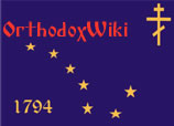
This logo was submitted by User:WebmasterConstantine on Tuesday, Sept. 27th 2005. He writes: "It is a modified Alaskan Flag, a Midnight Blue field with a Golden Big Dipper. Replacing Polaris, the North Star, is the Blessing Cross. The Year 1794 is also displayed, all pointing to the fact that Orthodox Christianity first set foot in America in 1794 on Alaskan Soil, that Christ, symbolzed by the North Star, is whom we navigate by, and that American Orthodoxy points to Christ, as proclaimed by our early Alaskan Fathers."
Comments:
- My initial take is this: I appreciate the symbolism very much, and I like the stylized font for "OrthodoxWiki." I am concerned however, that, though the official language of this Wiki is English, it is not intended specifically as an American (or North American) project. We are grateful to have contributors from all over the world. I also have concerns about the visual effect of the strong blue background and the square-block design. One thing I like about it though is the way it integrates an OrthodoxWiki logo with a sense of mission and history/heritage/legacy/the saints. It's a very nice creative effort in this regard. - Fr. John 16:41, 27 Sep 2005 (EDT)
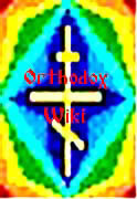
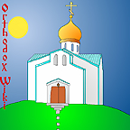
Two more from User:WebmasterConstantine
|
|
Comments
A usability tip: It's always useful to test/optimize graphics for color blind vision. Use this free simulator: http://www.vischeck.com/vischeck/vischeckURL.php Enter the URL of the current page with the logos(http://www2.orthodoxwiki.org/OrthodoxWiki:Logo_Submissions ), select a color vision type (try all three) and see if results are acceptable.
Iconic Book
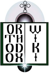
A logo suggestion from Raphael. I used the idea of a book such as one might see in an icon. The light of knowledge and a larger sphere representing "the net".
One more from User:Raphael
 Another logo suggestion from Raphael.
This one is now my first choice. It has a nice soothing blue background, and it gets the idea across. Put a period between Orthodox & Wiki, and it would be perfect.
WebmasterConstantine
- This is also a nice logo. My only concern is how it will look on any sort of textured or colored background (specifically the upper left corner of this page). It would be unfortunate to have to put it in a white box. I don't think it needs a period. --HappyGrevling
OOO WWW Logo
I received this by email anonymously this morning -- not sure who would get the credit. - Fr. John
Comments
I like the first "O" and the Cross being the "t", as well as the decreasing-sized wiki, but perhaps the other "o"s in "Orthodox" could just be regularly-sized for balance? [[User:Magda|—magda (talk)]] 12:32, 1 Oct 2005 (EDT)
- Looks like a second logo was submitted according to your suggestions, Magda. Fr. John
I consider this too much of a good thing. It's the type of thing I would do in my younger days. One O or T would be enough.
- WebmasterConstantine
Circle Logos
Two variations submitted by the same anonymous person as above.
Also acceptable. Subdued, but gets the idea across.
WebmasterConstantine
Submissions from Rdr. Andrew
Submissions from a friend of Magda
I asked a friend of mine to try his hand at a logo for Orthodoxwiki, and here is his work:
Submissions from Guldfisken
Here's an idea I've had. The scroll is for "knowledge", and the current OrthodoxWiki symbol signifies Orthodoxy.
There is a larger version available. I realise there's a problem with the top left edge of the scroll, but this is more of a draft, really.
Late Submissions
Hey. I think I'm still going to submit one today. I thought submissions were due today. I guess this will probably affect any votes I would receive because I know some have already voted. Can I still submit? Joe ( talk » inspect » chat ) 14:40, November 15, 2005 (CST)
Joe, it's just after midnight here, but go ahead and submit it. I'd love to see it. Fr. John 00:05, November 16, 2005 (CST)
- Father, this was earlier in the day. My submissions can be seen on the logos page. Joe.
Please voice your opinions or cast your votes about the logos!
Which one is your favorite and why?
Do you have ideas for logos you don't have the technical know-how to create?
etc.
Opinions
At some point, could there be a no-more-submissions-please-vote kinda thing? Perhaps people aren't voting because they may think something better will come along soon... -- oea 19:46, 23 Oct 2005 (EDT)
- Hi oea, I think that's a good idea. Already, I've put up a note that submissions will stay open through Nov. 13th. I don't think we'll go much beyond that. The deadline will prob. be soon after that. I'll prominently announce it once it gets closer to the date, then we'll have some time to decide together. Fr. John
Personally, I think the best submission is HappyGrevling's SealLogo1.jpg (round with world behind the cross). I think it looks very nice and encompasses the world Orthodox feel I think we want, e.g. not only American. I think the black and white version would also look nice on letterhead. I will readily admit that I did base my budded-cross idea on his (It took me a while to do this with a vector-based program). Other than that, I thought several of them were great, but a number looked either a.) too ethnic or b.) too unprofessional. two cents Joe ( talk » inspect » chat ) 23:04, November 15, 2005 (CST)
- OK, I've decided to be a little more specific about the ones I like. I don't like HappyGrevling's silver-cross-logo.png. Don't ask why I just don't. I thought Magda's friends work were very nice. I do like a more square look for the Wiki logo and I thought these rectangular logos wouldn't work. Baker's were very nice. Simple. Maybe too simple for some. Rublevpupil's submissions were nice, especially Rublevpupillogo2.jpg, although these too were rectangular.
- I like mine too. Aside from the fact that I am very (unfairly I am sure) late. I still don't like mine because a couple of the words are upside-down and I couldn't manage to convey the words OrthodoxWiki like I wanted to. I chose the quatrefoil because I felt it could symbolically represent the words shown and give the logo a sense of balance. Joe ( talk » inspect » chat ) 23:40, November 15, 2005 (CST)
Votes
Since I'm going to be away at the close of submissions (and probably the close of voting), I submit my vote as the first logo by HappyGrevling (world, with cross superimposed, with scroll around it); with big thumbs up to his other two. -- Pistevo 00:23, 31 October 2005 (CST)
- Sorry for fuzziness - the vote went to ScrollLogo, "big thumbs up" referred to SealLogo1 and 2. -- Pistevo 00:09, 3 November 2005 (CST)
Gotcha, thanks Pistevo! Fr. John
HappyGrevling has submitted a potential winner, I think - I mean his most recent one, with the cross lying diagonally . My vote goes to this one. - Guldfisken 11:12, 3 November 2005 (CST)
I think I like the simplicity of the first one by Baker. (I'm attempting to put everyone's votes visually together here; please let me know if I get something wrong. —magda (talk) 07:54, November 15, 2005 (CST)
OK, I know it's probably lame to vote for my own logo, but hey, that's why I designed it the way I did -- because I like it! My vote goes to the Silver Cross logo (my 5th submission), with the gold-cross-world logo and the first Seal logo tied for second. - Happy Grevling
I vote for HappyGrevling's logo #1. I like it becuase it is 3-D and is dynamic. --Tanyechka
My vote is for HappyGrevling's 3rd logo. Joffridus 12:47, November 15, 2005 (CST)
Votes:Danny
Although I would like to vote for my own logos, It would be a waste of a contest if the nicest looking one(s) were't accepted. Don't get me wrong, they are all nice, but I would have to go with HappyGrevling's one (the slanted 3d cross with 'www.OrthodoxWiki.org' over it in a curve style. I'd just have to go with that one. God Bless Everyone -- User:Danny 00:23, 15 November 2005
Votes:Constantine
I like Baker 1 and 2 and also BeHappyGrevling 2,3 and 4. My personal preference is Baker 2, but I vote for BeHappyGrevling 3. User:Constantine 16:23 Bulgarian Time, 15 November 2005
- I'm very happy that we have so many great logos to choose from. We'll close the submissions formally at midnight, but it's great if people's votes keep rolling in before that. Fr. John 10:41, November 15, 2005 (CST)
Votes:Katjuscha
I think my #1 vote would go to User:HappyGrevling #3 - it looks very professional, and it has the internet address integrated into it. I also like User:HappyGrevling #1, #2, and #5, User:Rublevpupil #2, and User:Raphael #2. Katjuscha 17:06, November 15, 2005 (CST)
Vote:Vandrona
I think I'd go for HappyGrevling 5 Vandrona
Vote:Joe Rodgers
I personally vote for HappyGrevling's SealLogo1.gif. Excellent work!
Yeah, maybe you're right about the silver cross logo, Joe. The more I think about it, it seems just a little odd that the cross is lying down. Something doesn't seem quite right about it. The cross should be a sign of victory, not defeat. Maybe the seal's better. But I can't even tell anymore! I'm too close to the project I guess! -H.G.
