Difference between revisions of "Spirit of Orthodoxy Choir"
m |
m |
||
| Line 1: | Line 1: | ||
This is the '''OrthodoxWiki Sandbox'''! Feel free to edit here to your heart's content! | This is the '''OrthodoxWiki Sandbox'''! Feel free to edit here to your heart's content! | ||
| + | ===Logos by [[User:HappyGrevling|HappyGrevling]]=== | ||
<gallery> | <gallery> | ||
| − | + | Image:GoldCrossWorldLogo.gif | |
| − | Image:GoldCrossWorldLogo.gif | ||
Image:DomesLogo.gif | Image:DomesLogo.gif | ||
| + | Image:SealLogo1.gif | ||
| + | Image:SealLogo2.gif | ||
</gallery> | </gallery> | ||
| − | + | ===Logos by [[User:WebmasterConstantine]]=== | |
| − | + | <gallery> | |
| − | + | Image:Northstar.jpg | |
| − | + | Image:Owcrossstar.jpg | |
| − | + | Image:Churchsun.jpg | |
| − | + | </gallery> | |
| − | |||
| − | |||
| − | |||
| − | |||
| − | |||
| − | == | ||
| − | |||
| − | |||
| − | |||
| − | |||
| − | |||
| − | |||
| − | |||
| − | |||
| − | |||
| − | |||
| − | |||
| − | |||
| − | |||
| − | |||
| − | |||
==Iconic Book == | ==Iconic Book == | ||
| Line 43: | Line 24: | ||
[[Image:Wiki_logo2.png|Raphael's suggestion 2]] Another logo suggestion from [[user:Raphael|Raphael]]. | [[Image:Wiki_logo2.png|Raphael's suggestion 2]] Another logo suggestion from [[user:Raphael|Raphael]]. | ||
| − | |||
| − | |||
| − | |||
| − | |||
| − | |||
| − | |||
| − | |||
==OOO WWW Logo== | ==OOO WWW Logo== | ||
Revision as of 18:48, October 26, 2005
This is the OrthodoxWiki Sandbox! Feel free to edit here to your heart's content!
Contents
Logos by HappyGrevling
Logos by User:WebmasterConstantine
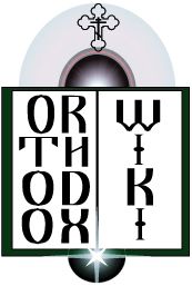
Iconic Book
A logo suggestion from Raphael. I used the idea of a book such as one might see in an icon. The light of knowledge and a larger sphere representing "the net".
One more from User:Raphael
 Another logo suggestion from Raphael.
OOO WWW Logo
I received this by email anonymously this morning -- not sure who would get the credit. - Fr. John
Comments
I like the first "O" and the Cross being the "t", as well as the decreasing-sized wiki, but perhaps the other "o"s in "Orthodox" could just be regularly-sized for balance? [[User:Magda|—magda (talk)]] 12:32, 1 Oct 2005 (EDT)
- Looks like a second logo was submitted according to your suggestions, Magda. Fr. John
I consider this too much of a good thing. It's the type of thing I would do in my younger days. One O or T would be enough.
- WebmasterConstantine
Circle Logos
Two variations submitted by the same anonymous person as above.
Also acceptable. Subdued, but gets the idea across.
WebmasterConstantine
Submissions from Rdr. Andrew
Submissions from a friend of Magda
I asked a friend of mine to try his hand at a logo for Orthodoxwiki, and here is his work:
Submissions from Guldfisken
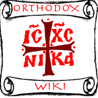
Here's an idea I've had. The scroll is for "knowledge", and the current OrthodoxWiki symbol signifies Orthodoxy.
There is a larger version available. I realise there's a problem with the top left edge of the scroll, but this is more of a draft, really.
